Learning how to use ArcGIS over the past two weeks has been an enjoyable and educational experience that showed through a hands-on experience just how useful the tool is for historians. The first map I created in ArcGIS is based on lesson one on how to use the program from the Geospatial Historian website. The lesson plan was straightforward to follow which was very useful for beginners, like myself who have never used a program like this before. Downloading the maps and spreadsheets and opening them up in ArcGIS was simple to do. The information needed for this lesson was in a large spreadsheet which would have taken a long time to accumulate and organize it well onto a computer which most historians would have to do when creating maps to help with their research. Uploading the maps into the program and manipulating them so that they could both be seen was also straightforward, and being able to change the colour of the image was a nice a nice touch as a way to personalize them a bit more.
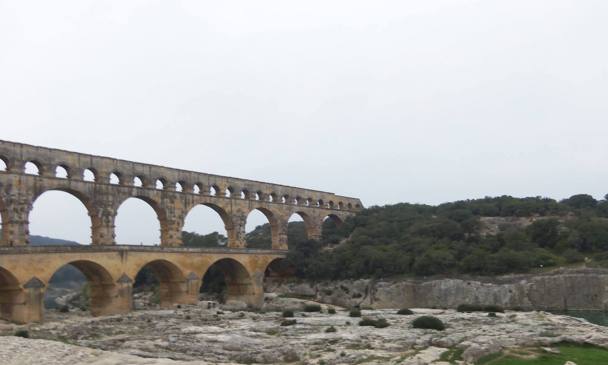
Once it was time to add the spreadsheet data, things got a bit more complicated but not too difficult to do by following the lesson’s instructions. Connecting the spreadsheet’s data, so it matched with the map’s data had a few steps that made sense with what the instructions said but could quickly be forgotten by beginners who are just getting used to using ArcGIS. After the data was connected, it could be explored such as how many people were born in a particular state during a specific year, how many people from a different country lived in a particular state, how many men and women were there, and so on. By being able to explore the data visually, different questions can be asked of the data since it can be looked at in a different way than coming up with questions after reading documents. For this map, the lesson outlines that for this map I will be figuring out how many Norwegian born people lived in the Great Plains states during the 1930s.
To get the map to show me what I wanted a series of steps were involved that the lesson outlined nicely. By following what was described, it was reasonably straightforward to get the map to show how many Norwegian-born people lived in each state compared to the total population. Without the lesson to guide me though it would be hard to figure out how to get the map to display the people and it would take me a while to memorize all the steps if I were to make future maps. After adding the title, legend, and scale, it could easily be seen that this map is showing the percentage of Norwegian-born people in each county in the Great Plains and where most of them lived.

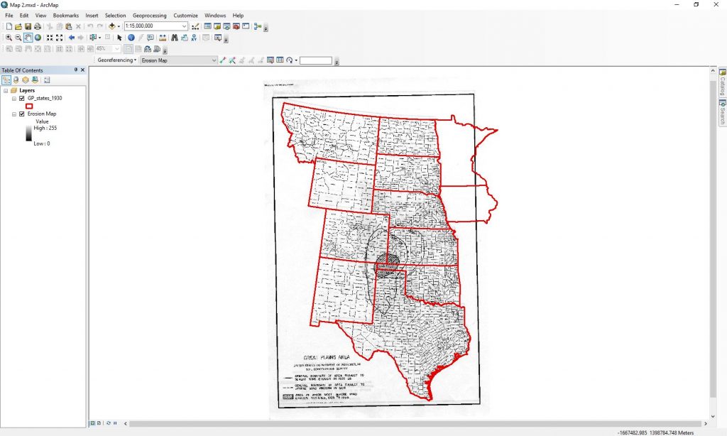
The third lesson from the Geospatial Historian taught me how to georeference scanned maps. I found this lesson to be quicker to complete but a bit more confusing to follow. Uploading the required maps and organizing them in the appropriate layer order was simple after creating the previous map. What was new was adding the georeferencing toolbar and adding the scanned map to it for it to be georeferenced with the map of the outlined states. Finding the toolbar was pretty easy but remembering the rest of the steps would take repeating the steps more to remember them. I found adding the control points to be one of the most simple steps, and it was interesting watching the maps begin to fit with each other as more points were added. The part of the lesson that confused me was the section that explained the offset of the maps and how those calculations related to how far off the map is distance wise. For a lesson on how to georeference the distance offset is not a big deal, however, it would be for someone who is doing research and needs that data to be as accurate as possible. To make the map more accurate would take adding more control points and deleting ones that have a high offset. Below is an image of the finished product of a scanned map fitted into a map of outlined states in ArcGIS.
Overall, this program was fun to use even though there are many steps to creating maps and would take a great deal of time to memorize them all. I think programs like ArcGIS are beneficial for historians because it allows data to be seen from a new visual perspective which can be helpful for historians to ask new questions in their research. Below is a link to the Geospatial Historian website which has tutorials on how to use free programs like ArcGIS for anyone who wants to learn something new.
https://geospatialhistorian.wordpress.com