Python For Beginners

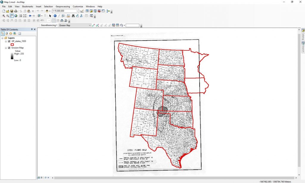
Python is a coding language that is used for programming that historians have begun to utilize to assist in their research.  Before taking this course, I never used or even heard of the program before so learning how to use it was an interesting learning experience.  I was able to complete up to lesson six and was starting lesson seven before I ran out of time.  The lessons were simple to follow with the beginning ones being straightforward to understand but then got a bit more difficult as they went on.

The first three lessons were great for a beginner like myself who was entirely new to Python.  The first lesson was straightforward where you type ‘hello world’ and run it through the program to see how it works.  The second lesson was learning about HTML and web pages.  After learning about HTML and how it works earlier in the year, it was an easy review lesson.  I found it helpful just to refresh my memory on HTML since I also have never used it before this class.  The third lesson got more into the different workings of Python.  It went through different technicalities around how the codes are typed out.  It was interesting to see how the different codes worked when they were run in the program.  It was easy for me to follow the lesson plan, but I had a more difficult time trying to understand the point of it and where it was going.

Lessons four to six got into even more details on the various uses for Python.  Lesson Four was about functions and modules of codes and how to reuse codes to make programming easier.  It was easy to follow the steps and recreate the codes, but it was harder for me to understand the difference between functions and modules.  I also had a hard time trying to picture how these codes would be used in a program and what their overall purpose is.  Lesson five was more intriguing, and I could see why it is essential and useful for a wide range of users.  The lesson taught how to download webpages so that its content could be saved which I found pretty straightforward to follow along and complete.  The last lesson I completed was six, and I found it to be more interesting than some of the other ones.  It taught how to manipulate message strings to change the final message when the program was run.  It taught different ways to run words more than once, make the letters upper or lower case, count the letters, add or subtract words, and so on.  It was cool to do, and I could see how some of these manipulation codes could be useful when typing out a long program.

I learned after this brief introduction to Python is that I do not enjoy the program that much and probably won’t use it any time in the foreseeable future.  I do not know enough about computer science and programming to fully understand the concepts and the different parts that go into making codes.  I would probably appreciate the workings of Python better if I took more time to look into it, but I do not have any interest in learning more about it right now.  I also found it hard to understand how this program would help historians in their research.  Some of the lessons such as downloading webpages and turning the web data into textual data would be helpful to historians who are using information from websites.  I think that Python, like any digital tool, can be useful to historians, but at the same time it probably is not the most helpful tool.  I think it would benefit the historians who know how to use it effectively or have the time to learn how to use it and apply it to their research.  For the people who do not know how to use it and do not have the time or interest to learn then the program is not useful.


Trying Out ArcGIS

Learning how to use ArcGIS over the past two weeks has been an enjoyable and educational experience that showed through a hands-on experience just how useful the tool is for historians.  The first map I created in ArcGIS is based on lesson one on how to use the program from the Geospatial Historian website.  The lesson plan was straightforward to follow which was very useful for beginners, like myself who have never used a program like this before.  Downloading the maps and spreadsheets and opening them up in ArcGIS was simple to do.  The information needed for this lesson was in a large spreadsheet which would have taken a long time to accumulate and organize it well onto a computer which most historians would have to do when creating maps to help with their research.  Uploading the maps into the program and manipulating them so that they could both be seen was also straightforward, and being able to change the colour of the image was a nice a nice touch as a way to personalize them a bit more.

Once it was time to add the spreadsheet data, things got a bit more complicated but not too difficult to do by following the lesson’s instructions.  Connecting the spreadsheet’s data, so it matched with the map’s data had a few steps that made sense with what the instructions said but could quickly be forgotten by beginners who are just getting used to using ArcGIS.  After the data was connected, it could be explored such as how many people were born in a particular state during a specific year, how many people from a different country lived in a particular state, how many men and women were there, and so on.  By being able to explore the data visually, different questions can be asked of the data since it can be looked at in a different way than coming up with questions after reading documents.  For this map, the lesson outlines that for this map I will be figuring out how many Norwegian born people lived in the Great Plains states during the 1930s.

To get the map to show me what I wanted a series of steps were involved that the lesson outlined nicely.  By following what was described, it was reasonably straightforward to get the map to show how many Norwegian-born people lived in each state compared to the total population.  Without the lesson to guide me though it would be hard to figure out how to get the map to display the people and it would take me a while to memorize all the steps if I were to make future maps.  After adding the title, legend, and scale, it could easily be seen that this map is showing the percentage of Norwegian-born people in each county in the Great Plains and where most of them lived.

The first map created using ArcGIS and the program layout

The third lesson from the Geospatial Historian taught me how to georeference scanned maps.  I found this lesson to be quicker to complete but a bit more confusing to follow.  Uploading the required maps and organizing them in the appropriate layer order was simple after creating the previous map.  What was new was adding the georeferencing toolbar and adding the scanned map to it for it to be georeferenced with the map of the outlined states.  Finding the toolbar was pretty easy but remembering the rest of the steps would take repeating the steps more to remember them.  I found adding the control points to be one of the most simple steps, and it was interesting watching the maps begin to fit with each other as more points were added.  The part of the lesson that confused me was the section that explained the offset of the maps and how those calculations related to how far off the map is distance wise.  For a lesson on how to georeference the distance offset is not a big deal, however,  it would be for someone who is doing research and needs that data to be as accurate as possible.  To make the map more accurate would take adding more control points and deleting ones that have a high offset.  Below is an image of the finished product of a scanned map fitted into a map of outlined states in ArcGIS.

The second map created using ArcGIS and the program layout

Overall, this program was fun to use even though there are many steps to creating maps and would take a great deal of time to memorize them all.  I think programs like ArcGIS are beneficial for historians because it allows data to be seen from a new visual perspective which can be helpful for historians to ask new questions in their research.  Below is a link to the Geospatial Historian website which has tutorials on how to use free programs like ArcGIS for anyone who wants to learn something new.

https://geospatialhistorian.wordpress.com


The Digital Tool Palladio

The digital tool I looked into is called Palladio which is a program used to organize data and display it in a visual manner.  It was a collaborative project created by a number of people which include Dan Edelstein, Nicole Coleman, Ethan Jewett, Eliza Wells, Giorgio Caviglia, and Mark Braude.  An earlier version of it was created in 2009, and with the help of various grants such as the NEH Implementation Grant the creators were able to build it into the Palladio tool it is today.  Agencies such as The National Endowment for the Humanities agency, CESTA, and the Stanford Libraries also helped in the creation of the project.

Palladio is a program that a historian or researcher can use as a way to visually see data and how it is connected.  There are several different ways that data can be displayed so that a person can see the results from a number of different views.  The first way is a map view where you can see how data such as places are related or connected to other places.  An example of this would be having a list of people and showing where they were born and where they died.  Another view is the graph view which connects the data being analyzed based on how it is organized.  The website’s example is how people in various classes were connected to other classes by the people they knew.  Some other display styles are a table view which can be used to organize all the data and a gallery so the subjects can be quickly found.

The tool is mainly used for the study of how certain items are connected.  It could be used to see how people were connected to other people or places across the world.  Another way could be how certain items such as commodities were connected to places or even people.  It is a tool created so that researchers and historians can visually see how the data they have gathered for their research is connected so that they can answer questions or ask new ones.

The many ways that it can show data is one of its main strengths and makes it a valuable digital tool for historians.  Researchers who are working with sources that contain a lot of information that has similarities and can be categorized will find this program useful in seeing patterns that might be missed when just reading it.  Being able to see the data being studied in a variety of ways can help in asking new research questions that one might not have thought about before.  Using spreadsheets to keep track of large amounts of information is useful for remembering certain details when dealing with it in large quantities.  Adding those spreadsheets into a program that can display it as a picture gives you another way of looking at the data which can be refreshing after looking at that data from a certain view for a long time.  Palladio’s greatest strength is that it can present data in a more visual way with different visual types to choose from.

Palladio also has a lot of weaknesses that need to be addressed.  The tool, I feel, is targetted towards graduate students and researchers rather than undergraduate students or the general public.  It is very narrow in its purpose in that it is only for visually displaying data which can be a negative thing because the only people who will be using it are higher level researchers.  I feel like not a whole lot of people will use it due to its narrow focus and complexity.

  For someone who is not great with computers, creating spreadsheets, and organizing data it can be very complicated to understand how to use.  It also is not very useful to everyone such as someone who does not have access to a lot of primary sources to gather the data or people who are doing research on topics where graphable data is not really necessary.  There are help links on the website which are not useful for someone wanting to learn how to efficiently use the program.  There is a tutorial and frequently asked questions page which can help answer some questions but maybe not all of them.  There are some videos on YouTube and other websites with tutorials that might be more useful than the actual site on how to properly use the program.

The current version of Palladio came from the program that was used to create a project called Mapping the Republic of Letters.  That project is about the network of correspondents that scientists had before modern technology and how wide it actually was.  The only other projects I could find that used this tool were testimonials that graduate students did or are currently doing on the site’s testimonial page.  The testimonies did not have the full projects on them but a sample of the research they were doing so that the reader could get a sense of what they were researching.  Though this digital tool may not be widely used by all historians, it is still a useful program to help facilitate research that has a lot of data and present it in an interesting visual way.

If you are interested in checking out Palladio and want to try it out click here.


A Look Into the September 11 Digital Archive

The September 11 Digital Archive is a website that was created after the terrorist attacks on the World Trade Centres in New York, the Pentagon, and in Pennsylvania.  Its purpose is to remember and commemorate the events of September 11, 2001, by collecting a wide range of sources from the event so that it can be preserved in one place for people to view.  There were many men and women collaborating on the project from a wide range of fields such as investigators, historians, information technology specialists, web developers, and designers.  In the present day, the main people in charge of maintaining the website are Sheila Brennan, Sharon Leon, Jim Safley, and Jeri Wieringa.  The partners that helped with the website’s creation are The Library of Congress, Smithsonian’s National Muesuem of American History, Sonic Memorial Project, American Red Cross, Mixnet, uReach, Seagate, and StreamingCulture.

The September 11 Digital Archive is available for the public to view with a variety of material to look at.  It is easy to find where the material is kept under the collections tab, which then takes you to a page that has the content organized into different categories.  The content is categorized based on what it is such as pictures, videos, art, personal accounts of the events, and so on.  There are also a few special sections one can explore such as the anniversary collection, or the collection of materials that the Smithsonian and Library of Congress have.  With so much content to look through, someone browsing the website can get a well-rounded view about 911 and the impact it had on the people who experienced the event and the country as a whole.

The site also has a helpful page that is dedicated to trying to answer questions that have come up about events of September 11 and the aftermath of it.  It is well planned and easy to follow.  It is organized into sections based on chronological order of the event and popular questions about it.  Under each question is a list of links one can go to to find answers to the question.  The links that are provided are from credible news sources such as The New York Times, Washington Post, BBC News, or from museum websites.  It is an extremely useful page for anyone who wants to know about the details of the event, especially as we get further away from the event.

I think this website is a valuable source to have because it such a large collection of material that can be accessed by anyone.  The layout of the website is pretty plain with everything clearly labeled and easy to find.  The collections page is simple and neat with that the materials are organized into similar mediums which makes it easier to look through the material.  The different tabs also allow visitors on the site to see how much of a variety of sources people have contributed to the site and the different ways individuals experienced the tragedy.  The wide range of materials this website has is crucial for keeping this event in the memory of the American people and the rest of the world.  This project has allowed ordinary citizens a place to share their stories, pictures, and feelings on the event which will hopefully be preserved long into the future.  By being in a digital age we can more easily preserve sources in a way that more people can access and allow more people to add their voice to the historical record.

It is clear that this website is intended to be used by a wide range of people.  The site itself is easy to navigate through and use which is nice for the average person to scroll through with ease.  It can be used as a teaching tool for elementary and high school students learning about the subject.  The website’s design and layout is not fancy, but the different kinds of content they have on it would keep children and teens interested.  It is also a good site for academic work because of how many primary sources it has.  An individual has so many sources they can go through and study.  There are a lot of possible research projects that students and historians can pursue with a wide range of content from accounts from eyewitnesses, reports from first responders, photographs taken at the sites during and after the attacks, and even art created by people as a response.  This website can be used so many different ways for a variety of people makes it an important website that deserves to be preserved so that future generations can learn about it.

September 11 Digital Archive may be a wonderful website but it still has some downfalls.  I find the design of the website a little too plain and simple which could cause people to lose interest and leave the site.  It is very easy to use due to being very simple which is also a bad thing because it is not very engaging and someone who is scrolling through it can lose interest fairly quickly.  I had some problems trying to view some of the videos and pictures and after a while, it became a bit frustrating trying to find something I could actually see.  Some of the content could not be viewed without downloading it which is another downfall because then the viewer has to take time to go find the file and delete it.  There are also so many steps to viewing an image in a larger format which becomes a hassle after browsing through the website for some time.  Overall though, the website is a wonderful place to learn about the September 11, 2001 attacks and get a feel on how it affected so many American people.

Feel free to check out and explore the website through the link below:                   http://911digitalarchive.org


Hello and Welcome

I am Maegan Klassen and I am in the third year of my undergraduate degree.  I am majoring in history and minoring in sociology.  I am taking this class because it seemed really interesting, and could provide useful knowledge for the future.