Python

Most people rely on computer programs in some capacity in their day to day lives but not everyone knows how to program. Most people who use computers are used to interacting with the computer’s GUI, the graphical user interface, rather than using the command-line interface. The thought of writing code in a command-line interface is a bit intimidating for someone like me who has minimal experience writing code. For an experienced programmer the sky is the limit in terms of what can be done writing code. If you have a function you want the computer to perform all you need to do is write the code for your program. For an inexperienced programmer the unfamiliarity of coding is daunting.

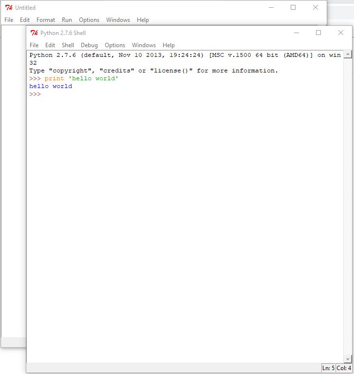
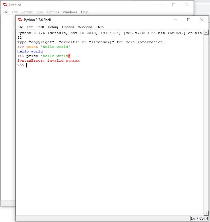
A helpful function when using the python command shell is that functions are color coded. This is done to help both novice and expert programmers to distinguish the different sections of the code and to help identify mistakes.

“Hello World”, the first bit of code everyone learns

When a program does not work as expected it is not always immediately clear what went wrong. A misspelled word is often times the reason a program does not work as expected. Having the function words color coded makes it easier to identify misspelled function words.

What happens when you misspell something

Learning the basic functions of python is fairly simple to get a hold of. Using the “print” command is fairly straight forward but the more advanced tasks you try to accomplish the less straight forward things become. One lesson offered on programminghistorian.org introduces users to using python to work with text files.

More complex code than printing “hello world”

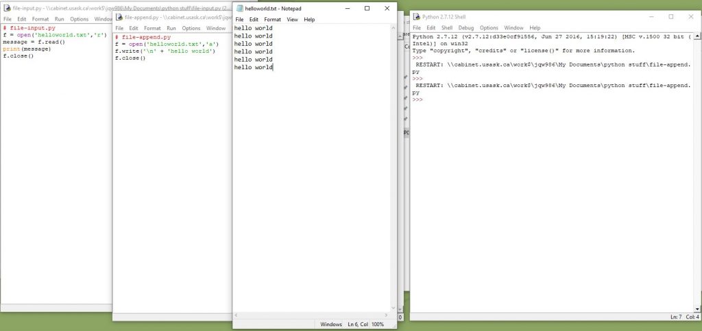
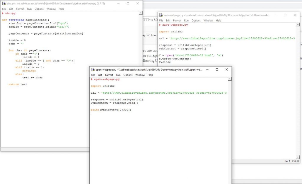
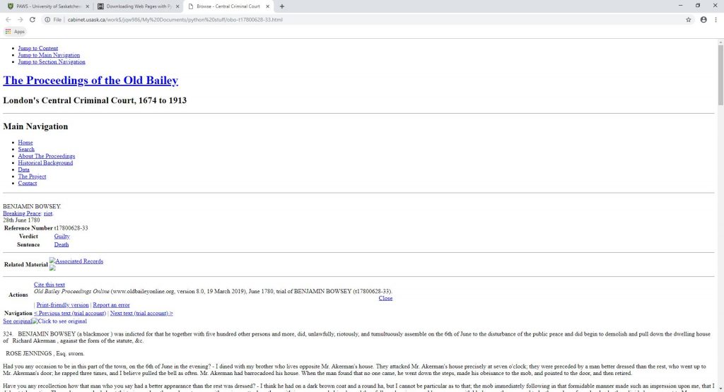
The code open in the two windows on the left of the above image is telling the computed to open the text file shown in the middle of the image and write the phrase “hello world”. This lesson from the Programming Historian involves getting different files to interact with one another, which is a step up from just telling the computer to print a line of text. Something I did not like was that upon running the program it was not immediately clear if the program had done what it was supposed to. The purpose of this lesson is to get users prepared for more advanced functions such as using python to download the contents of a web page. This function can be particularly useful for historians because of the constantly changing nature of the internet. Writing a program that automatically saves the contents of a webpage every so often can be a useful way to track changes and edits made to something like a Wikipedia page or a news article.

Code to download the contents of a webpage
Downloaded version of the webpage
The actual webpage

When I was going through the Programming Historian lessons I found myself heavily reliant upon the step-by-step nature of the lessons. Even for the more beginner lines of code that had been repeated throughout each lesson I felt the need to double check. The worry about missing a subtle but important piece of code such as a period or a bracket was always on my mind. If I didn’t have step-by-step lessons I doubt I would get very far with python. Learning python is just like trying to learn anything else, practice makes perfect. However with python I feel like it will take a significant amount more practice before I get the hang of it.

Based on my experiences with python I can see it being a very useful tool for historians as long as they know how to use it, or if they have friends who know how to use it. Creating programs to automatically archive webpages or programs to analyze and mine large bodies of text are just some examples of what historians might want to use python for. But given that it takes a good amount of time to get the hang of python and even then, many people will still struggle with it, it might be best to leave the programming components to programmers. Historians with minimal background in programming might be better off collaborating with python programmers rather than trying to learn python themselves. It is certainly useful to have at least a crash-course in python but going through the trouble of becoming fluent in python is unnecessary.

In terms of making a program to use for historical research purposes there is a good chance that someone else has already made a program to do what you are looking to do. Looking to open source software for a program that does what you want is one option for historians looking to use python but hoping to avoid having to program. Even the Programming Historian provides the completed program files at the end of each lesson. Although with the Programming Historian the main aim is to teach people how to use python themselves, you could just take the shortcut and download the ready-made program files.

Option to download the program files at the end of the lesson

Even if you chose to take the short cut and download a ready-made program you are probably going to need to edit the code a bit to make it work for your desired purpose. In this case it would be best to have at the very least some introductory knowledge about python.

ArcGIS

While ArcGIS is a useful tool that many people rely on to make high quality maps it can be almost as frustrating to use as it is useful. When you open the program you will probably notice that it is slow to start. This slow operating speed remains constant and the program occasionally freezes and crashes. Because of its proneness to crashing it is extremely important to frequently save your work. It seems that the more data you are trying to work with, the slower ArcGIS will run.

ArcGIS loading screen

The interface of ArcGIS looks and feels as though it has not been updated since it was first released. Whether this is intentional on the part of the developers, following the adage of “if it ain’t broke, don’t fix it”, or an unintentional lack of innovation, the program feels very dated to use. It is a complicated program to use, so it is understandable the developers would be reluctant to change things for fear of having experienced users needing to relearn things. However, I feel the program has not aged well, being left in the past as technology has advanced leaps and bounds since ArcGIS was initially released.

ArcGIS main screen

In most cases you are going to have to download data from somewhere that you will work with in ArcGIS. Finding data that works with ArcGIS online is not always a straight forward process but if you have a link that makes things easier. Once you find the data you want to work with you must go through a process of preparing the data for use.

Adding data and connecting folders

You will need to connect folders and add data to the map. While it sounds like it should be a simple process there are several steps to it which only means there are more opportunities for mistakes to be made. Part of the process of preparing your data before you can work with it is joining the data to different map layers. Once you have successfully gone through this process then you can begin to represent your data in a map.

In the table of contents the order of the map layers is an important detail that users must remember to pay attention to. When the “list by drawing order” option is selected you can freely rearrange the map layers. However if any of the other options are selected you will be unable to rearrange the map layers in the table of contents. Although this is a relatively simple issues to fix should you run into it, the solution may not be immediately obvious to a less experienced ArcGIS user. There are countless other issues in ArcGIS with quick and simple solutions that might not be immediately obvious to less experienced users. This can lead to a frustrating experience when trying to get the hang of using the program.

Table of Contents with “list by drawing order” selected in the top left

Probably one of the most straightforward tasks you can do in ArcGIS is adding the finishing touches to your map. Giving your map a title, table of contents, and scale bar are all important components of a finished map. The hard part about making a complete map is getting to this final stage.

A finished map

When it comes to less experienced users needing to produce a high quality map, ArcGIS is a necessary evil. Despite being incredibly not user friendly, ArcGIS dominates the world of mapping software. It is an incredibly useful program but it has a serious flaw in that it is very difficult to learn how to use. It can be a very useful tool for historians to use but without knowing how to use it, ArcGIS’s usefulness to historians is limited.

StoryMaps ESRI

This blog post is reviewing ESRI StoryMaps, the homepage for this digital tool is https://storymaps.arcgis.com/en/. StoryMaps is a tool made by ESRI that allows users to combine maps with images, text and other forms of media to tell a story. ESRI is the company behind the popular ArcGIS mapping software that can be both very useful and challenging to learn. StoryMaps presents itself as a tool that is versatile and easy to use. StoryMaps are often historically focused but there are also many examples of StoryMaps being used to showcase other kinds of projects. The main page of the StoryMaps website displays several projects that are examples of how StoryMaps can be used.

Examples of various StoryMap projects

The main page allows users to view other projects to get an idea of what StoryMaps can be used for. One project that caught my eye was a map that displays information about the voyage of the Titanic.

Geography, class, and fate: Passengers on the Titanic StoryMap

This map displays the route taken by the Titanic as well as information about where the passengers came from, what class ticket they had and if they survived the ships sinking. This allows users to see the relationship between the survival rates and the ticket class of the passengers. Other interesting information includes age of the passengers, hometown and intended destination. This StoryMap gets its data from Wikipedia’s list of titanic passengers and provides a link to the Wikipedia page.

Information about passengers can be seen on the left of the page

Something else I found interesting was that Parks Canada uses StoryMaps to display science and conservation stories. This StoryMap displays a map in upper left corner with a description just below it. The right hand two thirds of the screen is used to display an image or a video.

Parks Canada StoryMap

This map is slow to load but once it loads it runs quite smoothly. Each location on the StoryMap has a link to a Parks Canada webpage that gives more detail on the specific story. No broken links or other errors were obvious with this map which indicates that Parks Canada regularly maintains this digital project.

The Embattled Borderlands StoryMap focuses on the border between the United States and Mexico and the issues that arise from constructing barriers along the border. This StoryMap is formatted as one massive continuously scrolling page and while this may be a neat idea it causes frequent loading delays if you try to scroll through too quickly.

Note the long scroll bar on the right side of the image

You can use the titles displayed at the top of the page to help navigate through the page but this still does not solve the slow loading issue. It might be better if instead of having everything on one massive page the different sections were given their own page. This would make navigation quicker and would appear more organized.

The Rivers of Plastic StoryMap is presented in a similar format as the Embattled Borderlands story map in the way that it is one continuous scrolling web page. This StoryMap does not try to display as much information as the Embattled Borderlands StoryMap so it loads quicker but it lacks the option to navigate by clicking the titles of sections so the only way to navigate is by scrolling. This is more a personal preference, but I do not like that scrolling is the only way to navigate this StoryMap.

Note the lack of alternate ways to navigate the page

Navigation by scrolling seems to be a popular theme for StoryMaps. This format does a good job of presenting the story in a chronological order but if there is too much information to be loaded this can slow down the web page.

A StoryMap that I think is very well done is 100 Years of In Flanders Fields. This StoryMap is about the life of John McCrae and his famous First World War poem In Flanders Fields. This StoryMap incorporates images, maps, and text to tell McCrae’s story. Text and images appear on the left side of the screen which the user can scroll through and relevant maps are displayed on the right side of the screen. Although scrolling is the primary form of navigation there is also the option to navigate by clicking icons on the far left side of the screen. This StoryMap loads quicker than some of the other StoryMaps I have mentioned above and by not relying entirely on scrolling for navigation it is easier to navigate than StoryMaps that provide no alternative navigation options.

100 Years of In Flanders Fields

StoryMaps is an interesting tool that allows users to combine maps, text, and other forms of media to tell a story. StoryMaps are often used for historical websites such as the John McCrae or Titanic StoryMaps but as the Parks Canada StoryMap shows it can also be used for other purposes such as showcasing scientific and environmental research. One of the most popular formats for StoryMaps relies heavily on scrolling for navigating through the page. I don’t particularly like this format, but it might appeal more to others.

AfricaMaps

This blog post is reviewing a digital history project. The project I am looking at is the AfricaMap hosted at https://worldmap.harvard.edu/africamap/. This project provides users with a huge variety of ways to map Africa based on any number of criteria. This project is essentially a tool to visualize Africa in many ways based on the desired information the user wishes to see. Demographics are a main feature of this tool. Users can view different language groups, ethnic groups, or religious groups. Users can also view historical maps, data based on the slave trade, and conflict data. Layers can be combined to be viewed together which may allow users to recognize links or patterns between two data sets that might otherwise be difficult to recognize.

Two of my favorite categories are the “Historic Maps” and the “Period Maps”. There are several well known historical maps from different periods that are all produced by western map makers. This tool allows you to view these maps in a way that links them to a modern accurate map of Africa. This allows you to see the change over time in the knowledge the western world had about Africa and how accurate or rather inaccurate some features of these historical maps are.

Historical map by Frederico det Wit from 1675

I also like the feature that allows you to visualize conflict data. For the social conflict data, every country with a population over 1 million is covered with data collection beginning in 1990. A dot is assigned to represent each data count but the location of the dot on the map is not geographically accurate to the event it represents. This tool is a good feature to show which countries have the most conflict and are the least politically stable. Social conflict is defined as things such as protests, riots, strikes and other disturbances. A possible flaw with this tool is that is does not show data that may be missing or censored. Still this gives users a good general sense of the social conflict hot spots.

Social conflict map

I also like the feature that displays information about the slave trade. There are many data sets regarding the slave trade that can be visualized based on ports, number of ships, number of people and so on. You can choose to visualize the slave voyages showing the link between a sending and receiving slave port. The information from this is taken from http://www.slavevoyages.org/, a site we looked at in class. An issue with this map layer is that the link between ports is shown as a straight line which almost certainly does not show the actual route taken by a slave ship. Another issue is that when showing massive amount of data (about 60,000 voyages are mapped currently, not all have been mapped yet) the map becomes extremely cluttered.

Straight lines and too much info being displayed

Problems

Something I do not like is that not all the map layers seem to load properly. For example, under the “Trade Routes and Transportation” category, the layer “Trade Routes – Elisee & Keane” does not appear to load properly.

Improperly loaded map layer

The category “Explorers” with the layer “Livingston’s Congo 1870” also loads in this same way.  These are not the only layers that load improperly although most map layers do seem to load correctly. When selected, the “Trade Routes” layer displays a white background that covers the base map while displaying the trade routes.

Covered base map

Covering the base map reduces the usefulness of the displayed trade routes as they are completely void of spatial context. Under the “Utilities and Transportation” category, the “Global_NightLights” layer is also guilty of displaying a white background that covers the base map. This issue can be remedied by going into the display settings and reducing the opacity of the layer so that the base map becomes visible. This is a fairly simple solution but I feel this issue shouldn’t be present in the first place.

Solution

There are six different options when choosing a base map and four of them are hosted by Google. The problem is that none of the Google base maps appear to work, leaving only the ESRI base map and the Open StreetMap as the options for users. When any of the Google base maps are selected an error message appears.

Error when trying to use any Google base map

Maybe this is a problem with my browser but I tried using the different base maps on both Google Chrome and Safari and neither worked. This perhaps displays some of the issues with digital history, that websites need to be constantly maintained and that technology simply isn’t perfect. The street view option also does not appear to work as it relies on Google Maps to provide the street view.

The “Harvard Map Libraries Index” category is confusing. It gives you this image with no context.

What is this supposed to show?

There is no abstract provided so I am not sure what the aim of this map layer is. Most map layers provide an abstract that describe what the layer shows but many layers have no abstract, leaving the users to only guess.

Also the “1924 Ethnographic Survey of Africa – W. Roome” layer is simply a broken link, and broken links are always frustrating.

Broken link

All in all I found this site to be an interesting and useful tool but there is certainly room for improvement.

About Me

Hi everyone,

My name is Jared and I am in my fifth year of studies at the U of S. I recently finished the requirements for a degree in Regional and Urban Planning (convocation in June) and now I am working on the requirements for a degree in History and a certificate in Global Studies. Outside of the classroom I am a member of the Huskies Cross Country team and Track and Field team.