
This blog post is reviewing a digital history project. The project I am looking at is the AfricaMap hosted at https://worldmap.harvard.edu/africamap/. This project provides users with a huge variety of ways to map Africa based on any number of criteria. This project is essentially a tool to visualize Africa in many ways based on the desired information the user wishes to see. Demographics are a main feature of this tool. Users can view different language groups, ethnic groups, or religious groups. Users can also view historical maps, data based on the slave trade, and conflict data. Layers can be combined to be viewed together which may allow users to recognize links or patterns between two data sets that might otherwise be difficult to recognize.
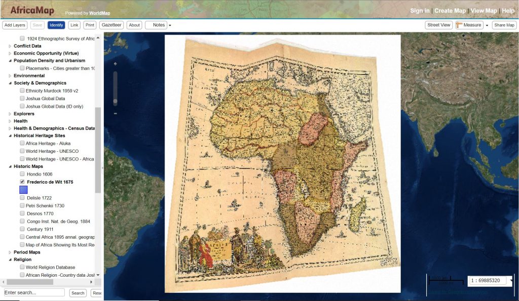
Two of my favorite categories are the “Historic Maps” and the “Period Maps”. There are several well known historical maps from different periods that are all produced by western map makers. This tool allows you to view these maps in a way that links them to a modern accurate map of Africa. This allows you to see the change over time in the knowledge the western world had about Africa and how accurate or rather inaccurate some features of these historical maps are.
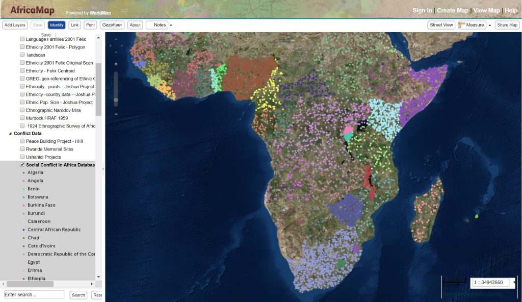
I also like the feature that allows you to visualize conflict data. For the social conflict data, every country with a population over 1 million is covered with data collection beginning in 1990. A dot is assigned to represent each data count but the location of the dot on the map is not geographically accurate to the event it represents. This tool is a good feature to show which countries have the most conflict and are the least politically stable. Social conflict is defined as things such as protests, riots, strikes and other disturbances. A possible flaw with this tool is that is does not show data that may be missing or censored. Still this gives users a good general sense of the social conflict hot spots.
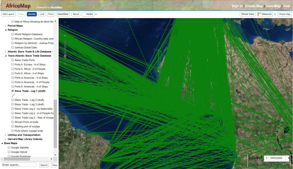
I also like the feature that displays information about the slave trade. There are many data sets regarding the slave trade that can be visualized based on ports, number of ships, number of people and so on. You can choose to visualize the slave voyages showing the link between a sending and receiving slave port. The information from this is taken from http://www.slavevoyages.org/, a site we looked at in class. An issue with this map layer is that the link between ports is shown as a straight line which almost certainly does not show the actual route taken by a slave ship. Another issue is that when showing massive amount of data (about 60,000 voyages are mapped currently, not all have been mapped yet) the map becomes extremely cluttered.
Problems
Something I do not like is that not all the map layers seem to load properly. For example, under the “Trade Routes and Transportation” category, the layer “Trade Routes – Elisee & Keane” does not appear to load properly.
The category “Explorers” with the layer “Livingston’s Congo 1870” also loads in this same way. These are not the only layers that load improperly although most map layers do seem to load correctly. When selected, the “Trade Routes” layer displays a white background that covers the base map while displaying the trade routes.
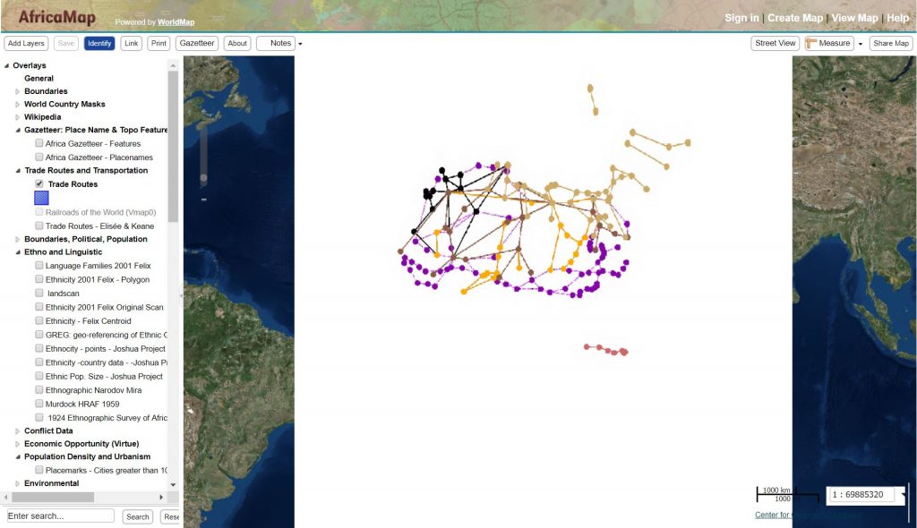
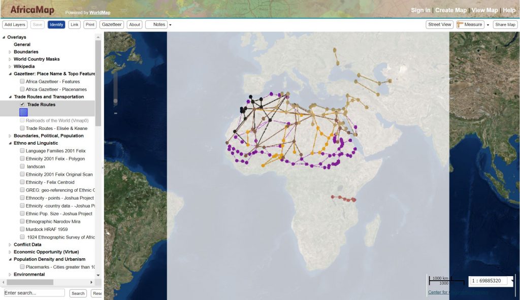
Covering the base map reduces the usefulness of the displayed trade routes as they are completely void of spatial context. Under the “Utilities and Transportation” category, the “Global_NightLights” layer is also guilty of displaying a white background that covers the base map. This issue can be remedied by going into the display settings and reducing the opacity of the layer so that the base map becomes visible. This is a fairly simple solution but I feel this issue shouldn’t be present in the first place.
There are six different options when choosing a base map and four of them are hosted by Google. The problem is that none of the Google base maps appear to work, leaving only the ESRI base map and the Open StreetMap as the options for users. When any of the Google base maps are selected an error message appears.
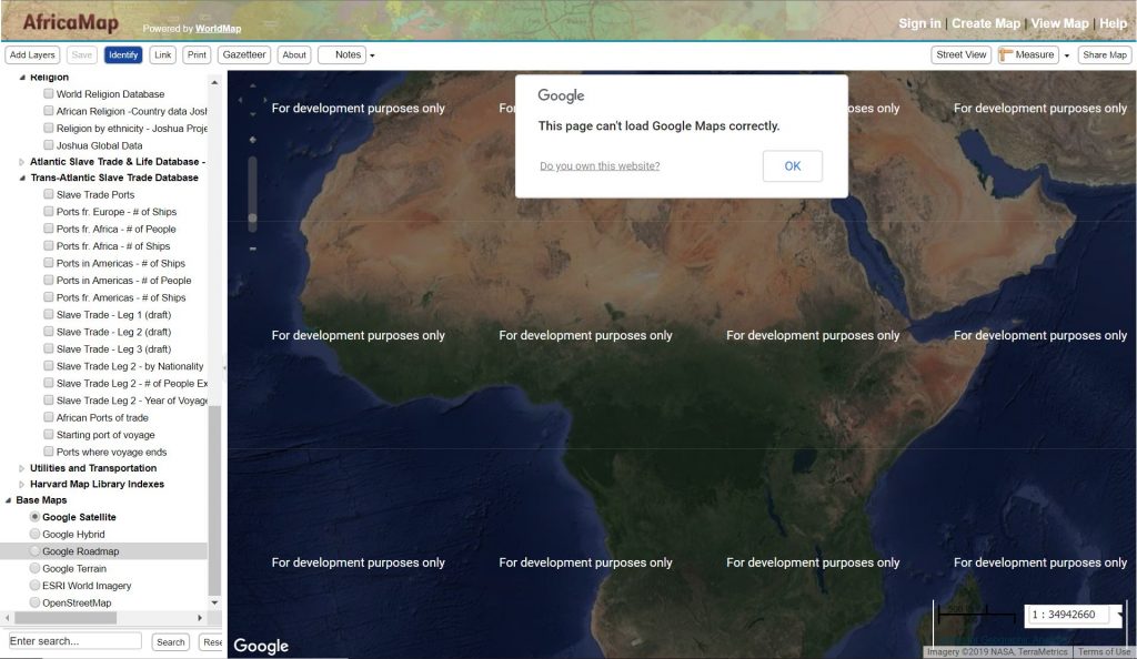
Maybe this is a problem with my browser but I tried using the different base maps on both Google Chrome and Safari and neither worked. This perhaps displays some of the issues with digital history, that websites need to be constantly maintained and that technology simply isn’t perfect. The street view option also does not appear to work as it relies on Google Maps to provide the street view.
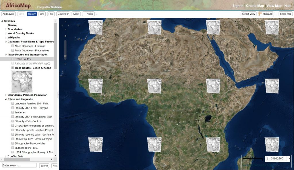
The “Harvard Map Libraries Index” category is confusing. It gives you this image with no context.
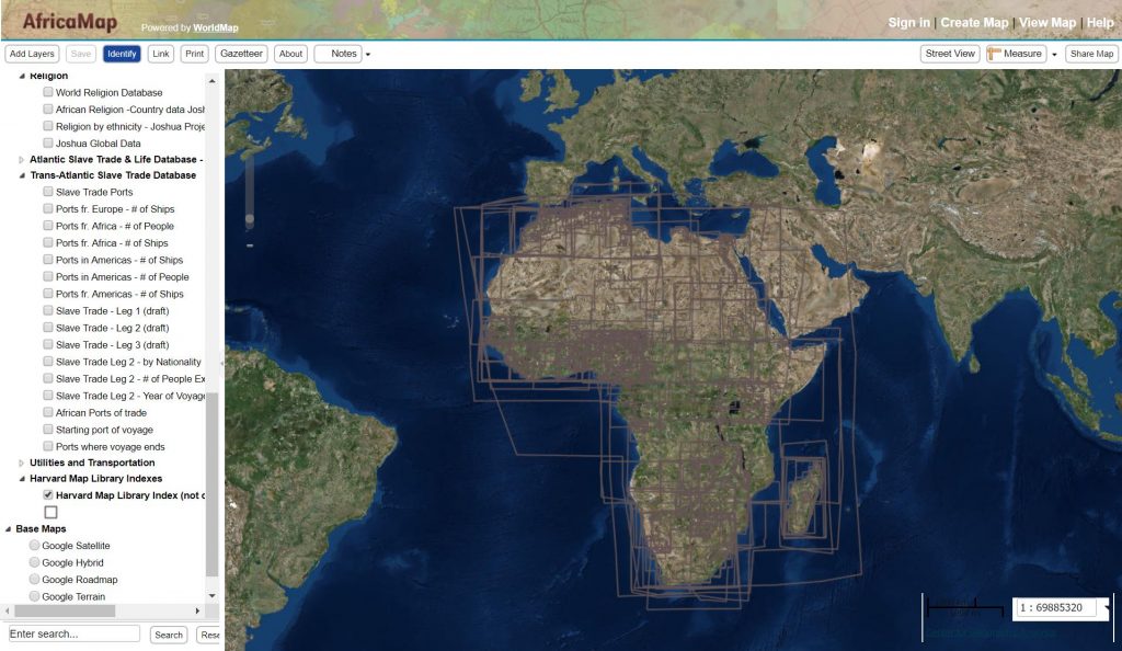
There is no abstract provided so I am not sure what the aim of this map layer is. Most map layers provide an abstract that describe what the layer shows but many layers have no abstract, leaving the users to only guess.
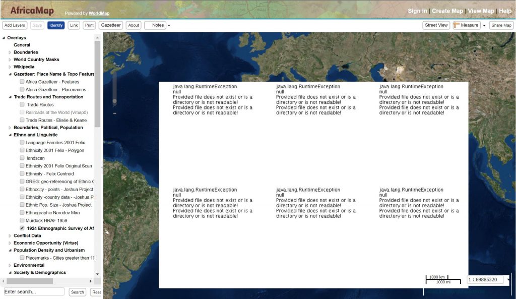
Also the “1924 Ethnographic Survey of Africa – W. Roome” layer is simply a broken link, and broken links are always frustrating.
All in all I found this site to be an interesting and useful tool but there is certainly room for improvement.