
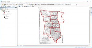
ArcGIS Map is a software that allows users to work with maps in a digital format and apply information to those maps so they may determine certain trends and answer various hypotheses. By navigating my way through lessons 1-3 from the Geospatial Historian website, I was able to learn how to apply data that was accumulated from the Great Plains of North America, centered around specific periods of time, onto a map of the area in question. I also learned how to “georeference” meaning imposing an image upon a map and getting the software to recognize each piece of media as one cohesive chunk of data (as shown below).
Doing this assisted me in both coming up with research questions that may have been missed if the work I was doing was conducted traditionally, as well as answering questions the lessons themselves posed. Throughout my process of working with ArcGIS Map, I have considered certain strengths and weaknesses that the software has in terms of being user-friendly and functional.
First, I will discuss the software’s downfalls. As I followed through the lessons, I realized how helpful the lessons themselves were when it came to simply familiarizing myself with the software. Without the step-by-step instructions, I may have become lost and confused earlier into the usage of the program. For the most part, the functions are displayed as icons rather than words. This made it more difficult to find certain functions that were not associated with a familiar symbol. For example, the button used to de-select data in the tables that were used, was shown as a puzzle piece looking icon. Without the clear notes of the lesson and its depiction of certain buttons, I would have either taken much longer to find the de-select button or would have missed it entirely.
Other problems were not as evident if you happened to not come across them. For instance, while attempting to click and drag certain items to rearrange the order of them in the Table of Contents, the action would occasionally not work. This was not a mere glitch in the system but rather a situation in which the program was picky. If you were not under the specific section of the Table of Contents entitled, “List by Drawing Order,” the program would not let you manipulate the layers of data. Although it is a minor problem, it easily became frustrating to me as a first-time user, before I had realized what was happening and learned how to resolve the situation.
Another small but inconveniencing dilemma I had faced while using ArcGIS Map was that the “Identify” function would not discontinue its use once you were done with it. If you are not familiar with this function it is a button labeled with a letter “I” with a circle around it, similar to what you would see at an information booth. This function allows the user to click on an area of a map and be notified about all metadata related to that area through the table of information attached to it. An example would be by clicked on a state or county and having a window pop up that provided the user with the name of the state or country they are addressing, along with other particular pieces of information. After I had clicked the “Identify” icon to use it, I could not get out of the function unless I chose another function to use subsequently.
Lastly, an extremely unfortunate concern with this software is its tendency to crash and shut down. An easy solution to this problem is to continuously save material and data as you alter it but this does not discount the fact that it’s an inconvenience and an annoyance. What I will say about this occurrence is that it is a reminder to users that GIS software is still evolving and, for the time being, the world of digital history still has room for improvements.
Overall, the program was reasonably easy to work with. Once I had completed the first two lessons, I found it easier to navigate and I gained a further understanding of what each function did and what tasks I could achieve through the software. The Table of Contents, where the layered sets of data were organized, made the program efficient and clean in appearance, avoiding the possibility of various components becoming muddled together. If I was using two or more sets of data collected in table form, they would be placed together in one window, similar to Excel, allowing me to toggle back and forth between data sets. This added towards the ease and organization of the program, giving it a more comfortable feeling for me as a new user. Even with the few minor details that need ironing out, ArcGIS is still a positive contributor to the world of digital history. It gives historians, geographers, and the like, the chance to advance their understandings of spatial events both past and present as well as visualize trends occurring over vast expanses of land.
Good observations Dakota. The software does create a steep learning curve with all of the buttons and small, but confusing, restrictions. That said, it is a lot easier to use than a command line based software and once you are familiar with the graphical user interface after a few weeks of using the software, these issues disappear.